
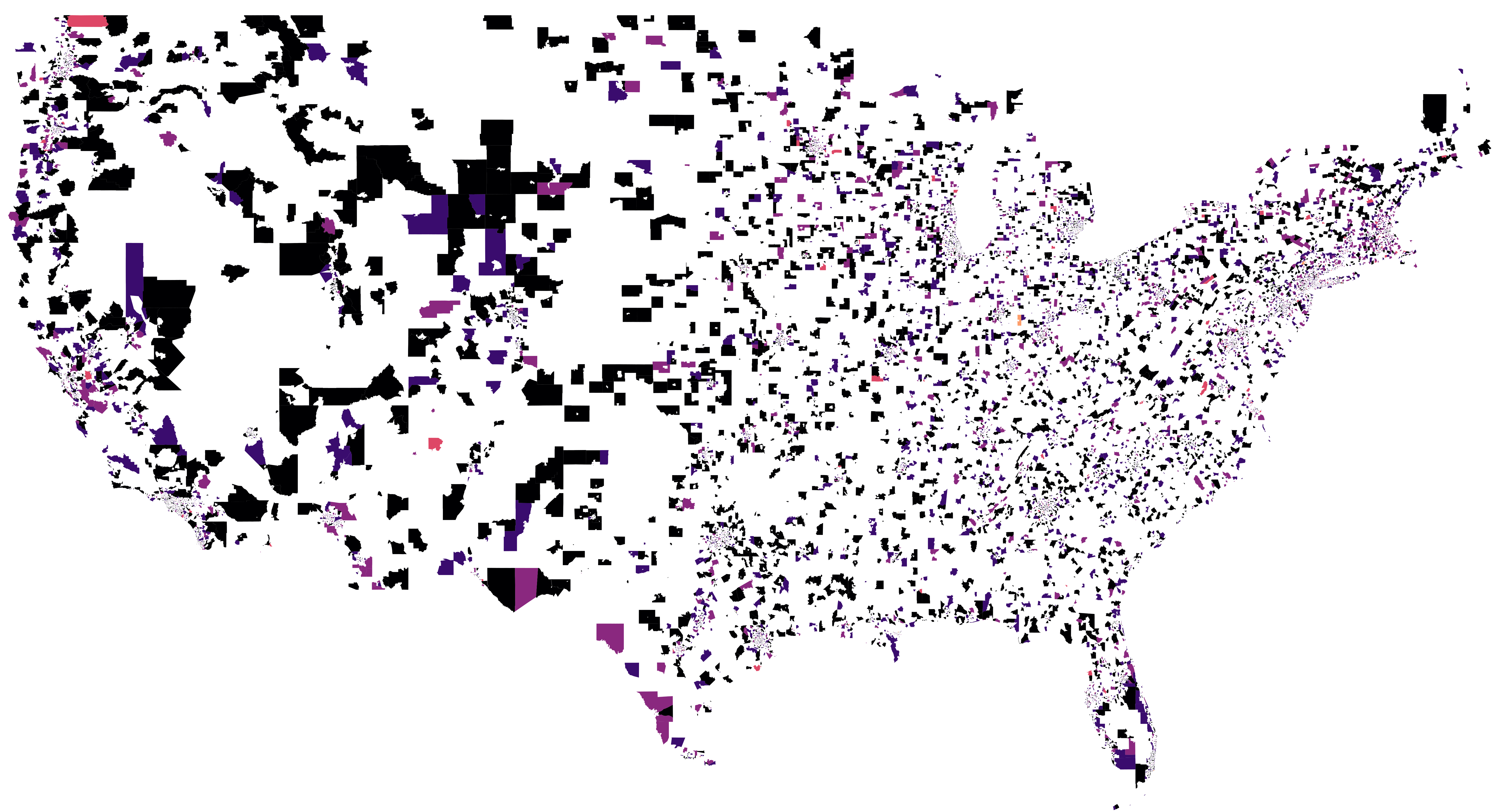


This is the average speed of the internet in US census tracts during 2009.
The data we're using here, the M-Lab dataset, started that year, so there's a lot of empty space.
But most of the areas that aren't empty are dark black, meaning people in those census areas had internet speeds below5 megabytes per second (Mbps).
Netflix was still mailing out DVD's in that dark time, long ago, but for reference, 5 Mbps is their minimum recomendation from streaming HD video.
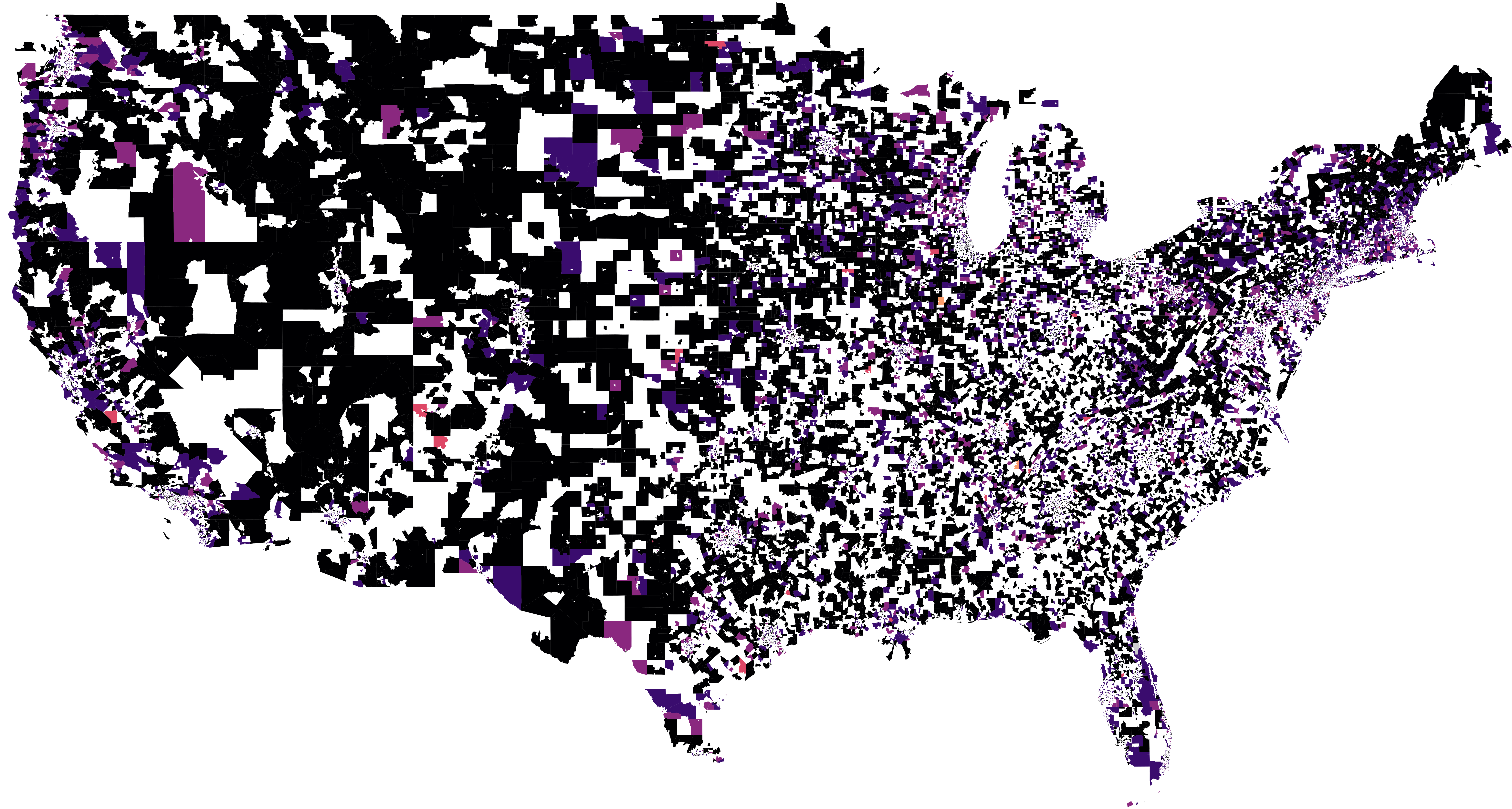
2012 is more of the same.
The Mountains area, the Midwest, and rural Maine are all as slow as ever.
And in a pattern that repeats over the next couple time chunks, the cooridor from Washington, D.C. to New York City has the fastest internet in the country.
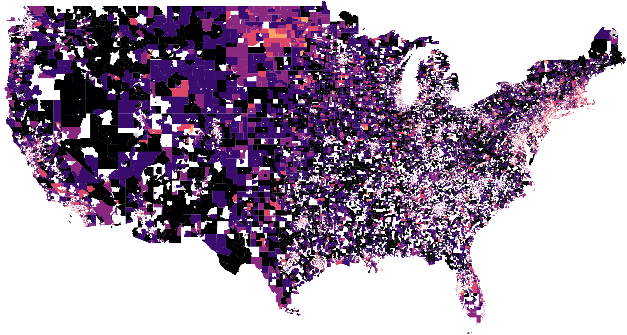
Here's the internet speed in 2015.
While North Dakota is mainly known for Fargo and the Great Plains, outside the D.C.-NYC corridor, it also has some of the fastest internet speeds in the country.
Though in this case, that's still not that fast–between 5 and 20 Mbps.
2018 finally brings good news to people who live outside the East Coast and North Dakota.
Where black was the dominant color from 2009 to 2015, strokes of deep purple and light violet now cover the country.
That year, for the first time, the plurality of census tracts had average internet speeds in the 5-10 and 10-20 Mbps ranges.
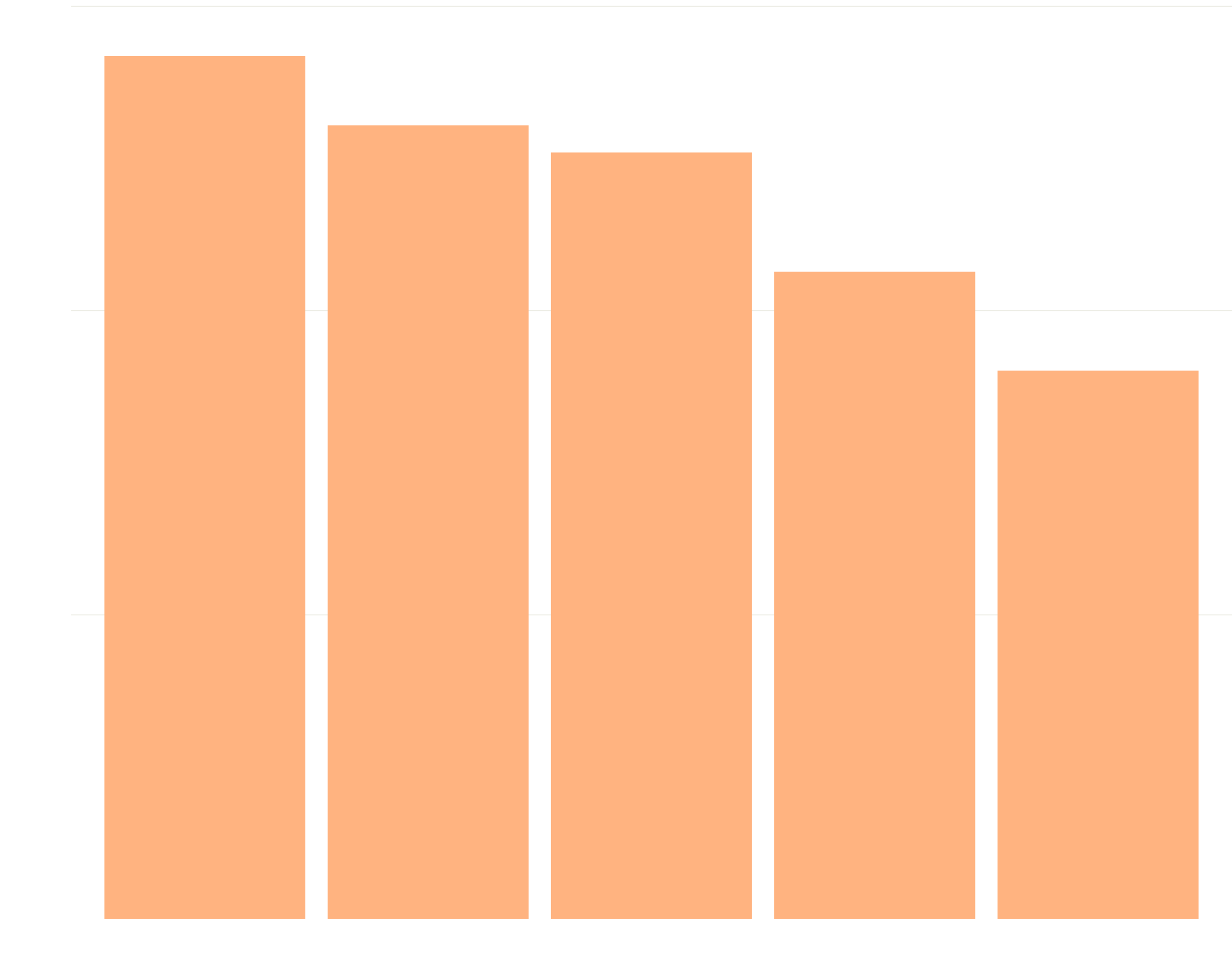
That's reflected in the average internet speed across the U.S. It increased from 4.6 in 2010 to 5.2 in 2012, to 7.9 in 2015, and finally to 10.5 in 2018.
For a lot of people, then, the internet is getting better at the tremendous improvement rate of technology.
But this happy tale of better internet isn't told in every home. There are lots of places where things are just the same as ever.
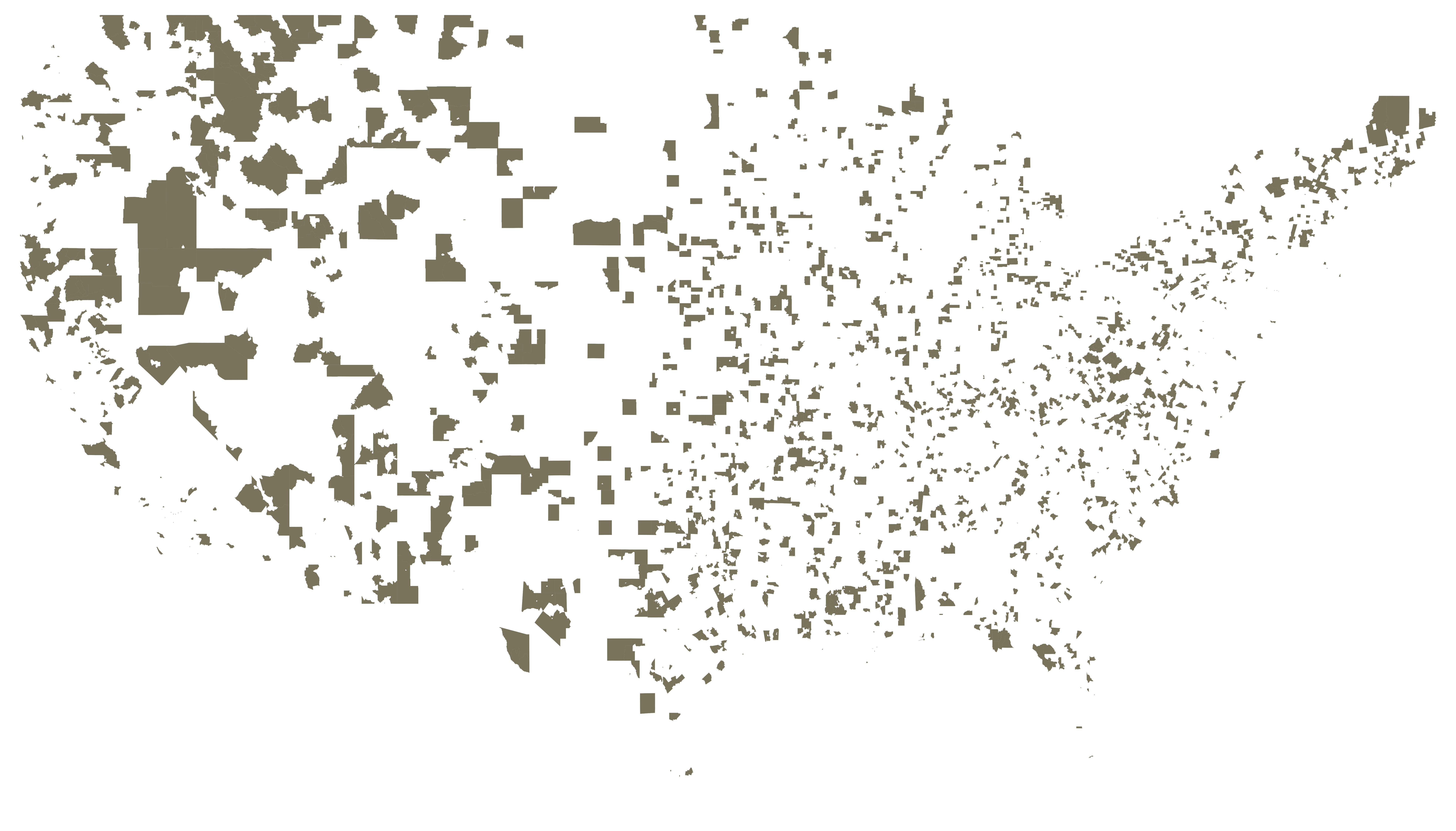
Areas like these–their internet speeds ignored by the march of technological progress seen from ocean to ocean–are what we call internet deserts.
These are the tracts with the same slow internet today that they had in 2010. Only North Dakota and Delaware are desert-free.
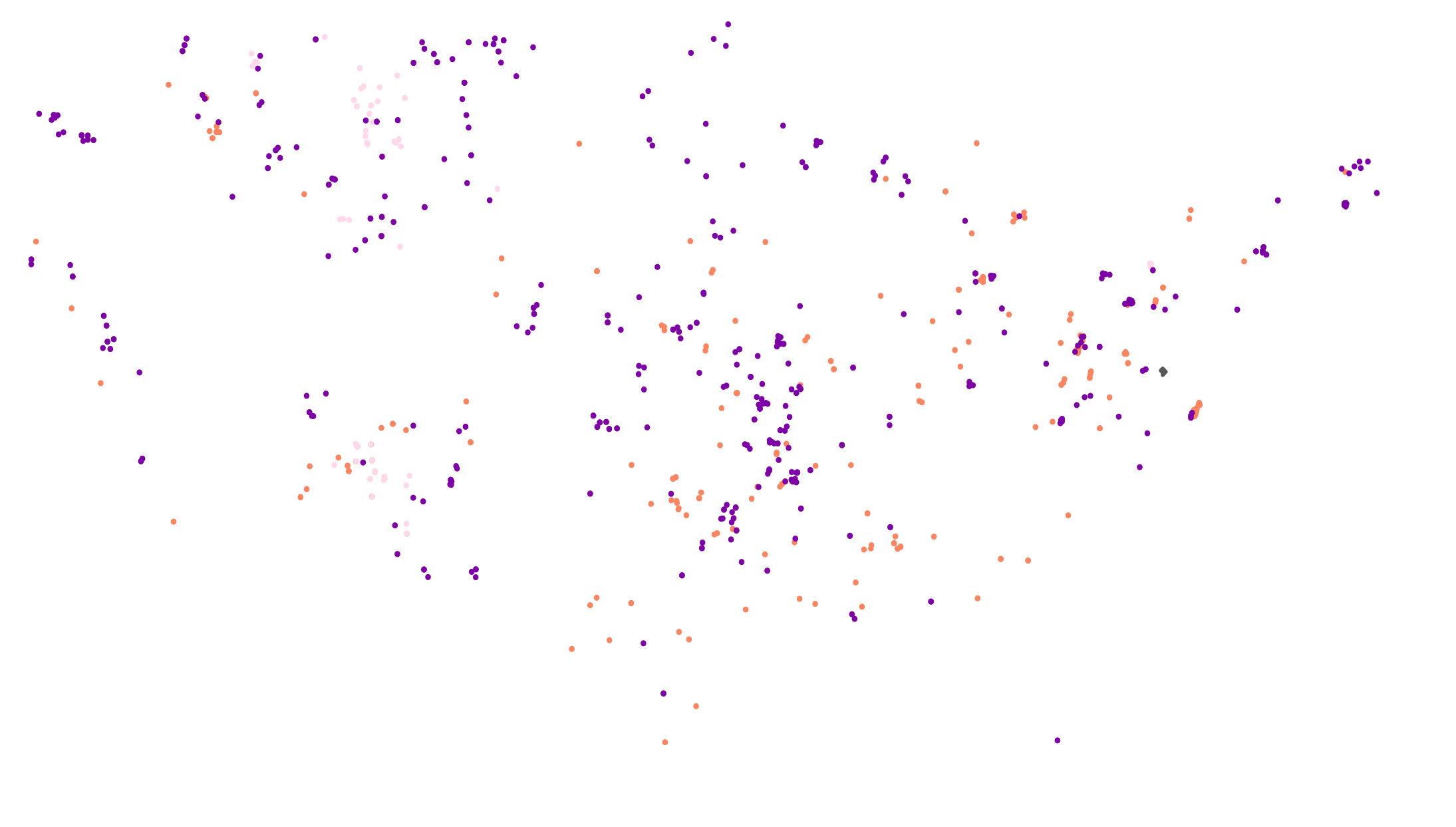
Another kind of internet desert is especially damaging.
More like food deserts and education deserts, these internet deserts are areas of the country where the internet is slow for everyone around.
Every orange dot on the map to the right is an area that matched two dismal conditions in 2018. First, their average internet speed was slower than 1.5 Mbps. Second, four of their five closest neighboring areas also had average internet speeds slower than 1.5 Mbps. The pink and purple dots are areas matching the same conditions but for high , instead of slow internet speed.
What's latency?
When you talk to a friend on the internet, your message has to physically leave your computer, travel through the pipes of the internet, and find its way into your friend's computer. The latency is the amount of time it takes your message to get from your computer to your friend's computer.
High latency is bad. Using the internet when you have high latency is like having a conversation with a very drunk person while sober. There's a longer lag time than usual between you saying something and them responding.
Average latency measures congestion, either in a home network or the broader internet. If a network isn't setup right, it'll be slow when it's being used many ways at once. These are the purple dots. In those places, family members ask each other to stop using Netflix so they can Skype a coworker. They can get responsive internet, sometimes, maybe, when everthing is just so.
Minimum latency measures the ideal experience a service provider can give a user. If minimum latency is high, truly live interaction on the internet is impossible, and no struggling on the user's part can change that.
Deserts don't spring up overnight at random. That's as true for the Gobi desert as it is for the food deserts experienced by Latino and Black residents of South Los Angeles. What do internet deserts have in common?
Looking at the demographics of census tracts that contain internet deserts is simulataneously enlightening and misleading. Compared with census tracts not containing deserts, desert tracts are 15% whiter, 3x less black, and roughly equivalent in income.
But in this case, race is an effect, not a cause. In reality, deserts are much more likely to show up in rural tracts than they are urban ones, by a factor of about 4. Since rural areas are also much whiter, tracts containing deserts are whiter as well.
In fact, of the five states with the highest percentage of internet desert tracts, four have white population percentages above the national average of 72% with two states having white populations of 90% or above.